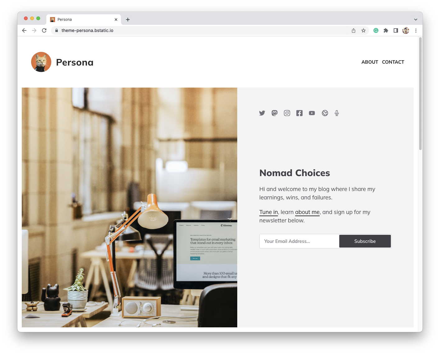
Persona is our very first theme with a hero section.
Our initial three themes are variations of a single concept with posts running from top to bottom.
Now, Persona allows the writer to introduce themselves and/or their business when their readers reach the blog for the first time.
View a Live Demo of the Persona theme.
Typography
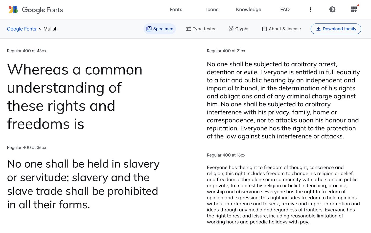
For the typeface, we have used Mulish, a versatile specimen that works for both text and display.
My favorite part about Persona is the social media icons inside the hero, which frame the overall content — giving the entire header section more weight and adding to its presence.
Newsletter subscription
Also, this is the first time we have positioned the newsletter subscription box at the top of the blog, which makes it an excellent choice for writers who are also interested in growing their audience.
The "Settings" area
In "Settings > Layout", one thing different with Persona is the extra elements that appear right after selecting the theme.
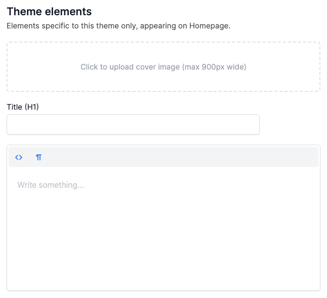
These new fields (image, H1, and hero/about description) apply to this theme only and any forthcoming themes with a similar structure.
Switching to Persona
Switching your theme is easy.
From the same Settings area, "Layout", make the selection, and your existing blog will switch to the new theme.
And if you don't already have a blog in blogstatic, register today, start writing, and grow an audience.
Publish your SEO–driven content!
Visit BlogMaker.app

