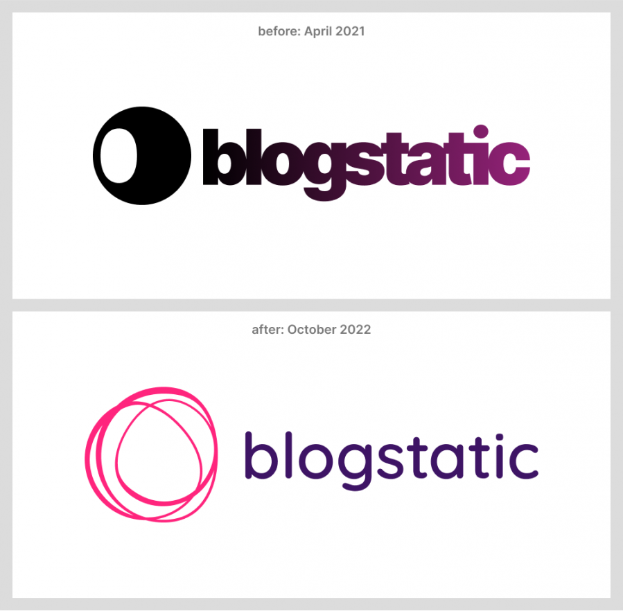
When blogstatic launched, its logo was represented by a circle with a lopsided counter inside, which was actually a part of the letter "b".
There wasn't much meaning attached to it beyond the visual.
Technically speaking, the ligatures formed within the logotype and the gradient were meant to give the brand a sturdier feel and stability.
Which, in retrospect, was a genuine approach.

With the constant improvements in blogstatic, the logo and the entire brand needed to be upgraded to reflect these changes and look toward a more progressive future.
The new logo takes a conceptual detour by giving the brand freedom of expression without any strict rules while contrasted by the logotype, which employs a dark rich purple hue that resonates with stability, although still breaking the mold by keeping the lowercase "b".

The new website carries over a similar approach of showing stability and still managing to keep its playful spirits intact.

The new symbol, logotype, and entire artwork give ways to create more with the brand, especially in terms of merchandise.

This rebrand marks a start of a new era for blogstatic. In which the brand and the app itself are more accessible to all.
Publish your SEO–driven content!
Visit BlogMaker.app


