
Understanding What Makes Blogs Succeed Today
To figure out how to design a blog that genuinely connects with people, we have to start with a hard truth: the blogging world is packed. Getting noticed isn't about the flashiest design. It’s about building instant trust and giving your reader a smooth experience from the second they arrive on your page. Your design choices are the very first clues a visitor gets about your credibility, professionalism, and the value you’re about to provide. Think of it as your blog's body language—it says a lot before you’ve even said a word.
This is a pretty big deal. The internet is overflowing with content. By 2025, there are an estimated 600 million blogs online, and creators are publishing around 6 million new posts every single day. That's some serious competition for your reader's attention. With so many alternatives, a visitor can and will click away in seconds if your site feels cluttered, old-fashioned, or just not trustworthy. If you want to see the full scope, you can explore more data on modern blogging to really understand why a strong first impression matters so much.
The Psychology of Modern Blog Design
Blogs that do well today get into the heads of their readers. They don't just dump content onto a page; they carefully guide the visitor through an experience. This all begins with empathy. What's your reader feeling when they land on your post? Are they frustrated and searching for a quick solution? Or are they kicking back, hoping for some inspiration?
- Clarity Over Clutter: A minimalist design with lots of white space isn’t just a trendy look; it's a way of showing respect for your reader's focus. It lets your content breathe and makes longer articles feel much less daunting.
- Visual Hierarchy: A great design uses size, color, and placement to show the reader what’s most important without them even realizing it. A bold headline, a slightly smaller sub-headline, and then the main text create a natural flow for the eyes. This subtle direction is what keeps people reading.
- Consistency Builds Trust: When your colors, fonts, and image style are consistent on every post and page, you create a cohesive and professional brand. On the other hand, inconsistency can feel jarring and amateurish, which slowly chips away at trust.
Learning from the Competition’s Blind Spots
Checking out other blogs in your niche is essential, but not just to see what they're doing right. Look for their weaknesses. Is their website painfully slow on a phone? Is their text tiny and hard to read? Are their calls-to-action completely hidden or missing altogether? Every design mistake you find on a competitor's blog is a chance for you to do better. Real success comes not just from writing great content, but from presenting that content in a way that respects your reader's time and attention. If you're ready to improve your writing, you might find our guide on blog post writing tips helpful.
Building Your Blog's Strategic Foundation
Before you jump into BlogMaker’s DesignStudio and get lost in a sea of fonts and colors, let's take a beat. The most common pitfall for new bloggers is treating design as the starting line. They create a stunning website that, sadly, goes nowhere. It’s like building a magnificent boat without a rudder; it looks impressive but drifts aimlessly. To steer clear of this, you need a solid strategic foundation. This is where you get completely clear on what your blog is trying to achieve.
This foundation goes deeper than just business goals. It's about truly understanding the one person you’re creating this for—your ideal reader. Knowing their age or location is just scratching the surface. What you really need to dig into are their pain points. What problems keep them up at night? What are they secretly hoping to achieve? A financial advice blog for millennials isn't for "millennials"; it's for a 28-year-old feeling crushed by student loan debt who wants to start investing but is terrified of making a costly mistake. This specific persona should inform every single design choice you make.
Defining Your Unique Angle and Personality
Once you know who you’re talking to, you have to figure out why they should listen to you instead of the countless other voices online. Your unique angle is what makes your blog the one they can't do without. Are you the funny, no-filter friend dishing out marketing advice? Or are you the calm, data-driven expert who breaks down complex subjects? This personality directly shapes your design.
For instance, a blog with a witty, energetic personality would naturally lean towards a vibrant color palette and bold, modern fonts. On the other hand, a blog centered on mindfulness and slow living would feel more authentic with earthy tones, soft typography, and a spacious, uncluttered layout. This personality is the glue between your strategy and your visual identity, building trust the moment someone lands on your page. To learn more about this connection, you can explore our guide on content strategy best practices.
Translating Strategy into Design Decisions
With your audience and personality mapped out, you can start making purposeful design choices. This strategic approach helps you avoid time-consuming and expensive redesigns later because every element has a job to do.
The table below breaks down how these fundamental questions directly shape your blog’s look, feel, and functionality. Answering them now is the most important part of learning how to design a blog that not only looks great but also fulfills its mission.
| Blog Strategy Framework: Questions That Shape Design | |||
|---|---|---|---|
| Strategy Element | Key Questions to Answer | Design Impact | Priority Level |
| Ideal Reader | Who are they, really? What specific problem do they need to solve? What keeps them from solving it? | This dictates the entire user experience (UX), from font size for readability to the overall tone of the microcopy. | High |
| Blog Personality | What is my blog's voice? Is it expert, friendly, witty, serious, or inspirational? | Directly influences the color palette, font families, and the style of your imagery (e.g., professional stock photos vs. quirky illustrations). | High |
| Core Goal | What is the #1 action a reader should take? (e.g., subscribe, buy a product, book a call). | Governs the placement, color, and copy of your primary call-to-action (CTA) buttons and forms. | High |
| Unique Angle | How is my blog different from the top 3 competitors? What unique value do I offer? | Shapes the homepage layout to immediately highlight what makes you different, guiding the visual hierarchy. | Medium |
Taking the time to define these elements ensures your design isn't just decoration; it's a powerful tool working to connect with your reader and achieve your goals.
Choosing Your Platform Like a Pro
Picking a platform for your blog is one of the most important decisions you'll make at the start. Think of it as the foundation for your house. It will either support your grand vision or seriously get in your way. This isn't just a technical choice; it’s a strategic move that affects your design freedom, long-term costs, and how much time you spend fighting with technology instead of writing. When figuring out how to design a blog, getting this right from the beginning will save you from so many future headaches.
Lots of new bloggers get pulled toward platforms like self-hosted WordPress because it's known for endless customization. And it's true, you can pretty much build anything you can imagine. But that freedom comes with a big catch: responsibility. You are the one in charge of finding good hosting, keeping security updated, fixing plugins that don't play well together, and making sure your site runs fast. The "free" software part is misleading, as costs for premium themes, necessary plugins, and quality hosting can add up fast, catching many by surprise.
Balancing Power with Simplicity
On the other side, you have all-in-one builders like Squarespace or Wix. They're great for getting a beautiful site online quickly with user-friendly templates. But that simplicity can eventually feel restrictive. You might find yourself locked into their system, unable to make specific design changes you want or dealing with slow page loads because of their underlying code. For a lot of bloggers, the sweet spot is in the middle—a platform made just for blogging that takes care of the technical stuff but still gives you real design control.
This is where a focused service like BlogMaker really delivers. It handles the hosting, security, and updates for you, so you don't have to think about it. But unlike the more rigid website builders, its DesignStudio was created specifically for bloggers. It offers detailed customization for fonts, colors, and layouts without you ever needing to see a line of code. This lets you build a unique brand identity instead of battling server settings. For a closer look at these first steps, our guide on how to start a blog offers a solid overview.
The Real Cost of a "Free" Blog
It’s vital to see past the advertised monthly fee and think about the total cost of ownership. This isn’t just about hosting fees and themes; it’s also about the value of your time. How many hours will you sink into fixing a broken plugin on a self-hosted site? What’s the hidden cost of a slow-loading page that makes potential readers click away?
To make this clearer, let's do an honest comparison of what you're actually getting with the most popular options. This table cuts through the marketing fluff to show you the real-world trade-offs.
Platform Reality Check: What You Really Get
Honest comparison of major blogging platforms including hidden costs, design limitations, and growth potential
| Platform | Design Freedom | True Monthly Cost | Ideal Blog Type | Complexity Level |
|---|---|---|---|---|
| Self-Hosted WordPress | Nearly Unlimited | $15 - $100+ (hosting, themes, plugins) | Highly customized, tech-heavy sites | High |
| Website Builders (e.g., Squarespace) | Template-Based | $16 - $50+ (plan dependent) | Visually-driven portfolios, simple blogs | Low |
| Minimalist Platforms (e.g., Ghost) | Theme-Dependent | $9 - $75+ (plus themes) | Membership & newsletter-focused blogs | Medium |
| BlogMaker | High (No-Code Studio) | Flat, predictable fee | Professional, content-first blogs | Very Low |
The key takeaway here is that there's no single "best" platform—only the best platform for your specific needs and technical comfort level. What looks cheap upfront can become expensive in time and add-on costs, while a predictable fee can free you up to focus purely on your content.
This decision-tree infographic helps show how your brand's vibe can guide your design choices, like picking colors and fonts.
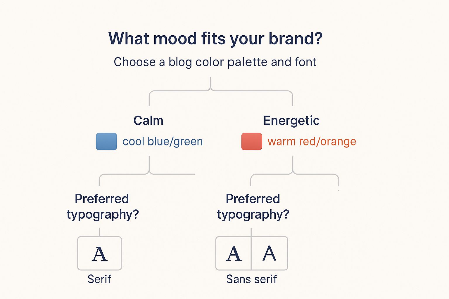
As the graphic illustrates, a simple question about your brand's personality can lead directly to clear design decisions, making a complex process much simpler. Choosing your platform works the same way. Start with your main goal—whether it's total control, ultimate simplicity, or a smart balance of both—and that will point you to the right tool for the job.
Creating a Visual Identity That Builds Trust
Your blog's design is having a constant conversation with your visitors. It’s either building a case for your credibility or subtly telling them to head for the exit. When figuring out how to design a blog, it's easy to accidentally choose elements that look amateur, which can erode trust before anyone reads a single word. This isn’t just about making things pretty; it’s about the psychology that turns a casual visitor into a loyal reader who trusts you with their email address.
This whole process kicks off with your color palette. The right combination can make readers feel at ease, while the wrong one feels jarring and unprofessional. For instance, financial advice blogs often lean on blues and greens because we associate those colors with stability and growth. A food blog, on the other hand, might go for warm, inviting colors like reds and oranges to spark feelings of comfort and appetite. The goal isn't just to pick your favorite colors but to choose hues that match the emotions you want your audience to feel.
The Power of Typography and Spacing
Beyond color, your typography does a lot of the heavy lifting. The fonts you select have a huge effect on readability, especially for longer articles. Eye-tracking studies have shown that when text is tough to read, users get tired and are more likely to click away. Professional designers often use a combination of a clear, legible body font (like a simple sans-serif) and a more distinct headline font to create a visual hierarchy. This approach guides the reader's eye naturally down the page.
Spacing, or white space, is just as crucial. Think of it as the "breathing room" around your text and images. Plenty of white space makes your content feel less cluttered and overwhelming, which can seriously increase the time visitors spend on your site. For a deeper look into these core elements, you can check out some excellent blog design best practices that cover these principles in greater detail.
Building a Cohesive Visual System
A strong visual identity is more than just a logo. It’s a consistent system of colors, fonts, and image styles that work together across your entire blog. This consistency is what makes your brand memorable and professional. When every post, page, and social media graphic shares the same visual DNA, you build recognition and authority.
Take a look at how an online tool like Canva uses a consistent, vibrant, and user-friendly design to present its own brand and features.
The image shows a clean, organized interface with a consistent color scheme and typography, which builds a user's confidence in the tool's abilities. This unified approach ensures your blog looks polished and trustworthy, whether it’s viewed on a phone during a commute or on a large desktop screen. It goes beyond looks; creating a strong visual identity is key to building audience trust. You can explore this ultimate guide to website branding to see how all these pieces fit together to create a powerful digital presence that encourages people to stick around. It’s this thoughtful system that separates high-performing blogs from the rest.
Designing for Engagement and Reader Loyalty
A great blog design is often invisible. It doesn’t scream for attention; instead, it works quietly in the background, guiding readers so effortlessly through your content that they stick around and explore without even realizing why. This part of the guide covers the layout principles that keep people scrolling and clicking. We'll move beyond just visual appeal to see how smart design choices can build a loyal following. It's about crafting an experience, not just a webpage.
When you're figuring out how to design a blog, your main focus should be on readability. This might sound simple, but it’s a detail many people miss. Your job is to remove any friction that makes reading feel like work. A good starting point is paragraph length. Keep them brief, ideally two to four sentences. This creates more white space—the empty area around text and images—which makes long articles feel less daunting and helps readers stay focused.
The placement of your images is also a big deal. A stunning photo can improve a post, but if it awkwardly chops up the text, it just becomes a distraction. Position visuals to support your points, not to interrupt them. For instance, you could place an image right after an introduction to set the mood or use a screenshot immediately after explaining a technical step. The goal is for visuals to strengthen the story, not steal the show.
Encouraging Content Discovery
Once you've made a single page easy to read, the next step is getting visitors to check out more of your site. This is where your navigation and internal linking strategy play a huge role. A messy, confusing menu can make people leave your site in a heartbeat. A clean, well-organized navigation bar, on the other hand, acts like a clear map.
Many successful blogs use a "library approach" on their main blog page instead of just a chronological list. A standard feed shows the newest posts first, but this can bury your best and most valuable evergreen content. By curating your blog homepage to highlight your most popular guides, pillar articles, and main categories, you immediately show new visitors your best stuff. This demonstrates your value right away and makes it simple for them to find the high-impact content they came for.
Internal links are your other secret weapon. These are just links that point from one page on your blog to another. When you use them well, they feel like helpful suggestions. For example, if you're discussing a specific tactic, you can link to a broader strategy guide you've written on the same topic. This keeps readers on your site longer and is also great for SEO, as it helps search engines understand your blog's structure and authority on a subject.
The Psychology of Engagement
Understanding how people read online is essential. User behavior studies using heat maps often show that people scan web pages in an "F-pattern." They read more at the top of the page and then scan down the left side. This means you should place your most important information and calls-to-action where eyes naturally land.
This insight also informs your calls-to-action (CTAs). A CTA isn't just a button; it's an invitation. Sticking a subscription form at the very bottom of a long post might not work if few readers actually get that far. Instead, weave CTAs naturally into your content, like offering a related checklist or content upgrade halfway through a post. The design itself—the button color, the space around it, and the text—all affect whether someone clicks. Beyond just looking good, it's crucial to actively encourage interaction; exploring different strategies to increase website engagement can help you connect with your audience and build loyalty.
Your design choices also directly impact how much engagement you receive. The length of your blog posts, their format, and the design all contribute to how well they perform. While the global average blog post length is around 1,394 words, deeper research suggests the sweet spot for both SEO and reader engagement is closer to 2,450 words. With popular content types including news pieces (47%), comprehensive guides (47%), and opinion articles (43%), your design needs to be flexible enough to present these different formats effectively. You can discover more insights from these blogging statistics and trends to shape your content and design strategy. This data confirms that designing for long-form, valuable content is a winning approach.
Optimizing Performance for Real-World Readers
A visually stunning blog is only half the battle. If your beautiful design takes forever to load or looks broken on a smartphone, you've lost the reader before they even see your first sentence. A huge chunk of blog traffic now comes from mobile devices, so performance isn't just a bonus—it's a core part of learning how to design a blog that actually gets read. A slow site not only frustrates people but can also drag down your search engine rankings, making performance a priority you can't ignore.
Images are often the biggest culprits behind slow load times. While high-quality visuals are crucial for keeping readers engaged, massive, unoptimized image files can bring your blog to a crawl. The good news is you don’t have to choose between quality and speed. Modern image formats like WebP provide much better compression than older formats like JPEG and PNG, dramatically cutting down file sizes with almost no noticeable drop in visual quality. Platforms like BlogMaker often handle this conversion automatically, but it's a great practice for any blogger to be aware of. For a deeper dive, check out a professional's guide to smarter file compression to learn how to shrink files without losing quality.
Making Your Design Mobile-First and Responsive
A responsive design automatically adjusts your blog's layout to look great on any screen, from a tiny phone to a huge desktop monitor. But the best practice today goes a step further with a mobile-first design philosophy. This means you plan the mobile version of your blog first, then adapt it for larger screens. Why? It forces you to prioritize what truly matters. You end up focusing on clean layouts, simple navigation, and quick-loading elements, which creates a better experience for everyone, no matter their device.
To check how your blog stacks up, you can use free tools that analyze your site's speed and overall user experience.
The report from Google's PageSpeed Insights, shown above, gives you a clear performance score and highlights specific problems, like oversized images or slow scripts, so you know exactly what needs fixing.
Advanced Performance Strategies
Beyond images, two other powerful techniques for speeding up your blog are caching and using a Content Delivery Network (CDN).
- Caching: Think of this as creating a temporary snapshot of your blog. When a visitor comes back, their browser can load the saved version much faster instead of re-downloading every single element. BlogMaker takes care of this automatically, but it’s a standard feature on any platform built for performance.
- CDN: A CDN stores copies of your blog on servers located all over the world. When someone from Japan visits your site, the content loads from a nearby server in Asia, not from one in North America. This drastically cuts down load times and makes your blog feel snappy for everyone, regardless of their location.
By combining smart image optimization with a mobile-first approach and using tools like caching and CDNs, you create a blog that is both beautiful and incredibly fast. This focus on performance shows you respect your reader’s time, which is essential for building a loyal audience and a key factor if you want to improve your blog traffic in the long run. A quick, reliable site is a mark of professionalism that builds trust just as effectively as your visual brand.
Launching Smart and Iterating for Growth
Your blog design isn't a masterpiece you frame and hang on the wall; it’s a living, breathing part of your brand that should evolve. The real skill in knowing how to design a blog that lasts is understanding when and how to make changes. Launching isn’t the finish line—it’s the starting gun for a process of smart iteration, fueled by real data, not just guesswork. It's the difference between tweaking for the sake of it and making purposeful improvements.
Before you announce your blog to the world, consider a "soft launch." This just means sharing it with a small, trusted group—think colleagues, mentors, or a handful of your ideal readers. Their initial feedback is gold. Ask them to perform specific tasks, like finding a particular post or signing up for your newsletter. Watching where they get stuck will reveal design flaws you're too close to see, helping you fix major issues before they affect a larger audience.
Turning Data into Design Decisions
Once you go public, your design's performance becomes a numbers game. This is where analytics come in. With a tool like BlogMaker’s built-in analytics, you can move beyond simple pageviews and dig into how people actually interact with your site.
- High bounce rate on a specific post? The first thing I'd check is the mobile layout. Is the introduction compelling? Is a pop-up blocking the content?
- Low time on page? Your content might be hard to read. Look at your font size, paragraph length, and the use of white space. Breaking up long walls of text with subheadings and images can make a huge difference.
- Poor newsletter conversions? It’s time to test your call-to-action (CTA). This is where A/B testing comes into play.
A/B testing, or split testing, is a methodical way to make improvements. Instead of overhauling your entire site based on a hunch, you test one small change at a time. For instance, you could show 50% of your visitors a green "Subscribe" button and the other 50% a blue one. After a week, you'll have clear data on which color performs better. This approach allows you to make evidence-based decisions that gradually improve your results without jarring your readers with constant changes.
Planning for Growth and Maintenance
Your blog's design needs to support its future. I once saw a successful blogger scale their site from a personal project into a full-blown media hub, and they didn't stick with their original design. As their content strategy grew to include video and downloadable guides, their layout had to adapt to feature these new formats prominently.
Plan for this kind of growth from the start. Your design should be flexible enough to accommodate new categories or a members-only section down the line. Regular maintenance is also crucial. I recommend setting aside time each quarter to:
- Check for broken links.
- Review your most popular posts and ensure the design still serves them well.
- Update old screenshots or outdated visual elements.
This ongoing attention ensures your blog always looks fresh and professional. A design isn't just a launch-day decision; it's a commitment to your reader's experience. It’s the framework that supports your growth, post by post.
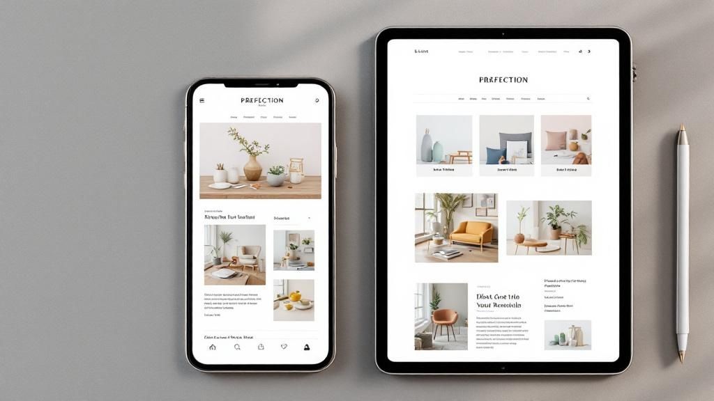
Ready to build a blog that not only looks incredible but is also built to grow with you? Discover how BlogMaker’s no-code DesignStudio and integrated analytics give you the power to launch smart and iterate with confidence.
SEO–ready, Analytics, No–code.
Your Content Publishing Engine
Deliver your SEO–driven content!
Visit BlogMaker.app